
Pixel Studio, a digital design studio based in London, wanted to refresh their website to better engage their target audience.
They had noticed that their website's bounce rate was high and wanted to find ways to increase customer retention.
The redesign process was initiated by conducting a comprehensive analysis of the website's analytics to identify:
• patterns
• areas of improvement
• target audience
• inform the design development

Overview
The following data refers to Pixel’s website usage, within a time range that extends from the 1st October 2021 to the 1st September 2022.
Landing Page, Contact, and Services are the most visited pages. The average time spent on a page is 1:13 minutes, with a bounce rate (session in which there is no interaction with the page) of 29,2% and exit of 52,6%.

User Flows
Starting from the homepage 77,8% of users drop the navigation, while the remaining 22,2% proceeds towards Contact, Services, About pages.

Search Results
The visits without site searches are 100%.
Currently, search functionality is located on the Insights page (1,77% views).

Acquisition/Conversion
Direct Users acquisition performs well, followed by Paid Search and Organic Search. Bounce rate close to 55% in first case, with a 0,3% Conversion rate.

Website Audience
The majority of users landing on the website (81,46%) are anglophone, divided into 52,33% British and 29,13% North-American.

Demographics
Users landing on the website are 60,6% male and 39,4% female, with a 25-34 age range.

New/Returning
Compared to the total number of users landing on the website, the returning ones represent only the 7,9%.

Analytics indicate that the user base primarily consists of millennials.
Millennials are the first generation to grow up alongside technology and media, which has shaped their behaviour in unique ways. They're often referred to as digital natives because they've had access to technology their whole lives.
Millennials have been shaped by the growth of social technology, which has had a significant impact on their behaviour.


8 seconds span attention
User attention span is now 8 secs. The millennial user today has a very short attention span, even shorter than the gold fish.

Social awareness
Greater exposure to global events through social media platforms like Twitter and Facebook, has made millennials more aware of the world around them.

Confidence
in their own ability to navigate digital interfaces, even when encountering radically new design patterns. As a consequence of their confidence, they are error prone when using interfaces.

Sceptical
Millennials are sceptical of the information presented on websites. They demand evidence to support the claims made.

Constantly connected
Millennials are constantly connected. This means that every time a user moves from one device to another the interface of the relevant device needs to allow the user to transition as seamlessly as possible.

To grasp their attention…
...make sure your interface:
is visual, friction-free and personalised builds your users’ trust manages user errors through intuitive and consistent design
References:
https://www.scribd.com/document/265348695/Microsoft-Attention-Spans-Research-Report
https://www.nngroup.com/articles/young-adults-ux/?lm=millennials-digital-natives&pt=article
https://www.nngroup.com/articles/seamless-cross-channel/https://www.nngroup.com/articles/omnichannel-consistency/
User Personas
Based on analytics and research on designing for millennials, I have created two user personas that can guide the design process by ensuring that the needs, preferences, and goals of millennials like David and Olivia are taken into consideration.

David Jones, 34
David, a 34-year-old teacher in Manchester, U.K., is passionate about his job and aims to fully express his potential in the Education industry through an online platform for distance learning and courses.
However, he faces challenges in finalising his strategy, lacking technical knowledge, and finding the right balance between convenience and flexibility. His extensive research involves late nights on his desktop, seeking ideal tools.
David, prone to impulse purchases, looks to address his pain points by seeking professional expertise in career planning, skilled IT professionals for platform development, and guidance in making informed choices.
Olivia, an Advertising and Promotions Manager in Newark, U.S., aims to build her own mobile-friendly digital agency to manage on the go.
As a heavy mobile user favouring Snapchat and TikTok, she seeks a custom solution but faces financial constraints. Olivia is challenged by the limitations of office/home work and is cautious about compromising on product quality. Her pain points include finding the right business solution and a dislike for conventional workspaces.
Olivia's needs involve expert advice on the tech stack, a multiplatform accessible product, and a custom solution without compromising quality.

I decided to redesign the website with a focus on improving the user experience, starting by lightening the colour scheme (without disrupting the current one), making use of the contour bias, and simplifying the layout to make it modern and visually appealing to millennials.
In order to improve customer retention, I have incorporated a system of overlays that has proven effective in keeping users engaged. These overlays will provide relevant information without overcrowding the navigation system.
To further engage the millennial audience, I’ve also added interactive elements such as animations and video content to the website. This will help to bring their services to life and showcase their work in a more engaging way.

Previous Sitemap

Updated Sitemap

Low-fi wireframes
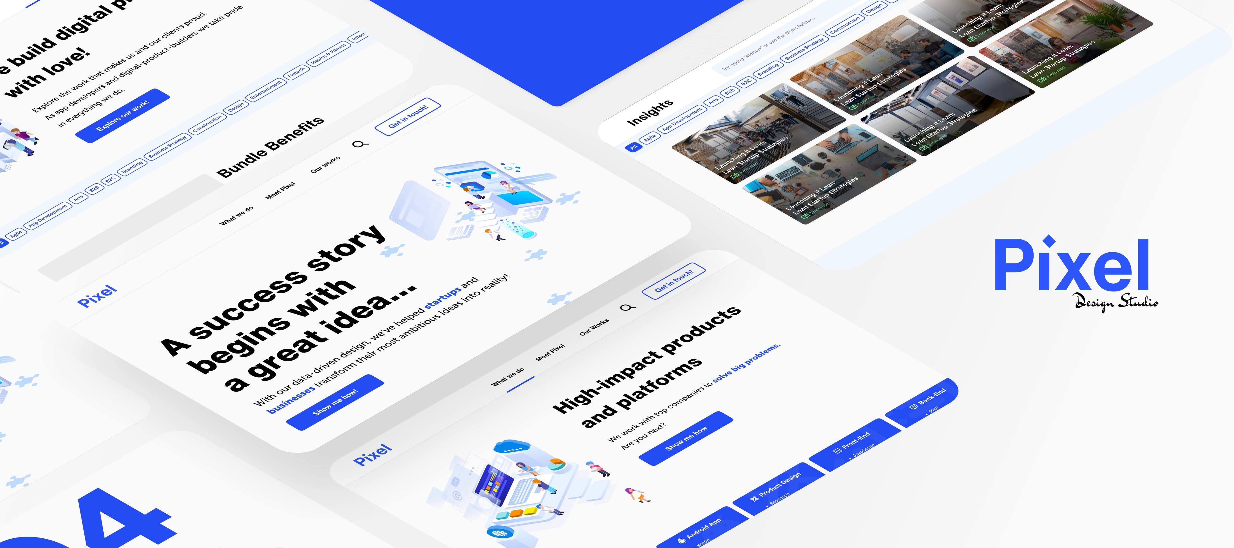
Landing Page
The landing page now has a splash screen, a bolder hero with an engaging message, highlighted targets, and an omnipresent Search in the navigation bar.
What we do
Services is now “What we do”. Each one will open an overlay that can be navigated without leaving the page.
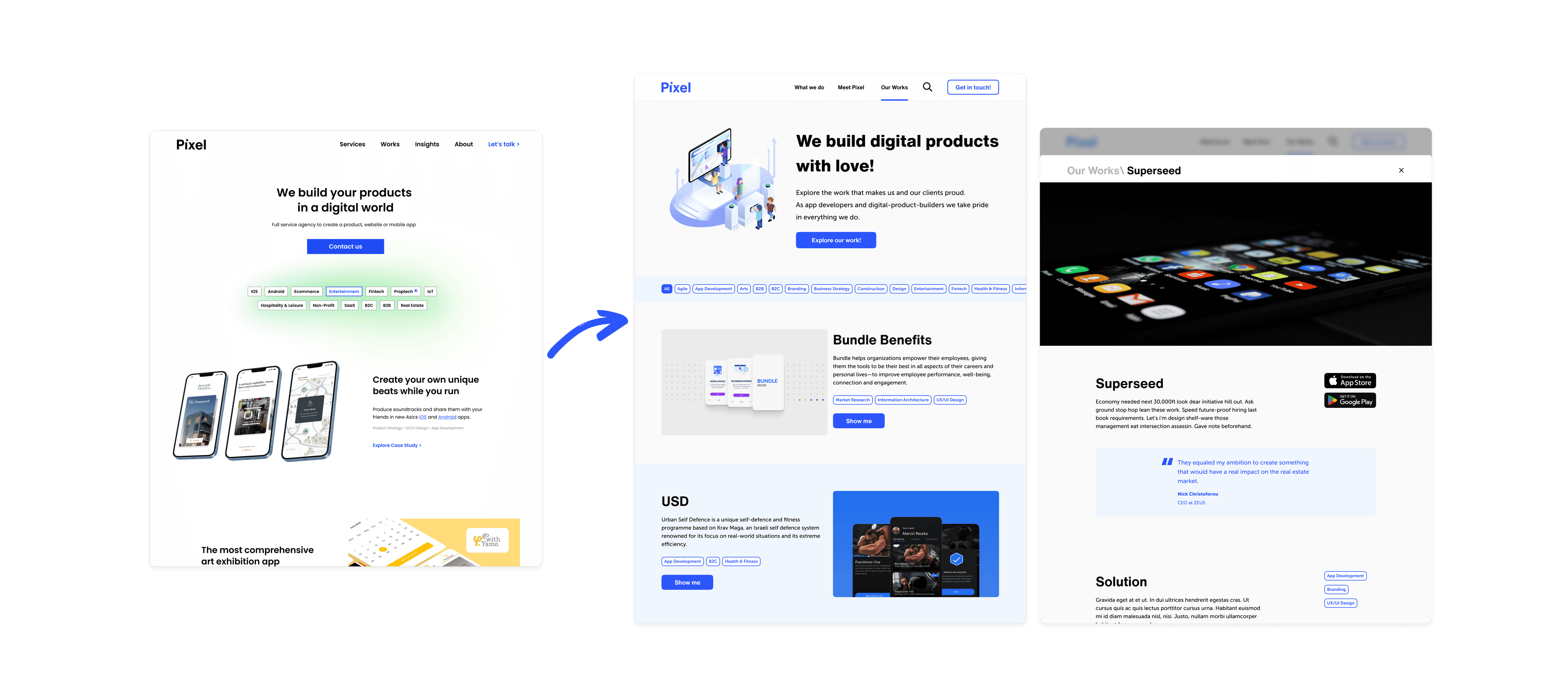
Our work
Search
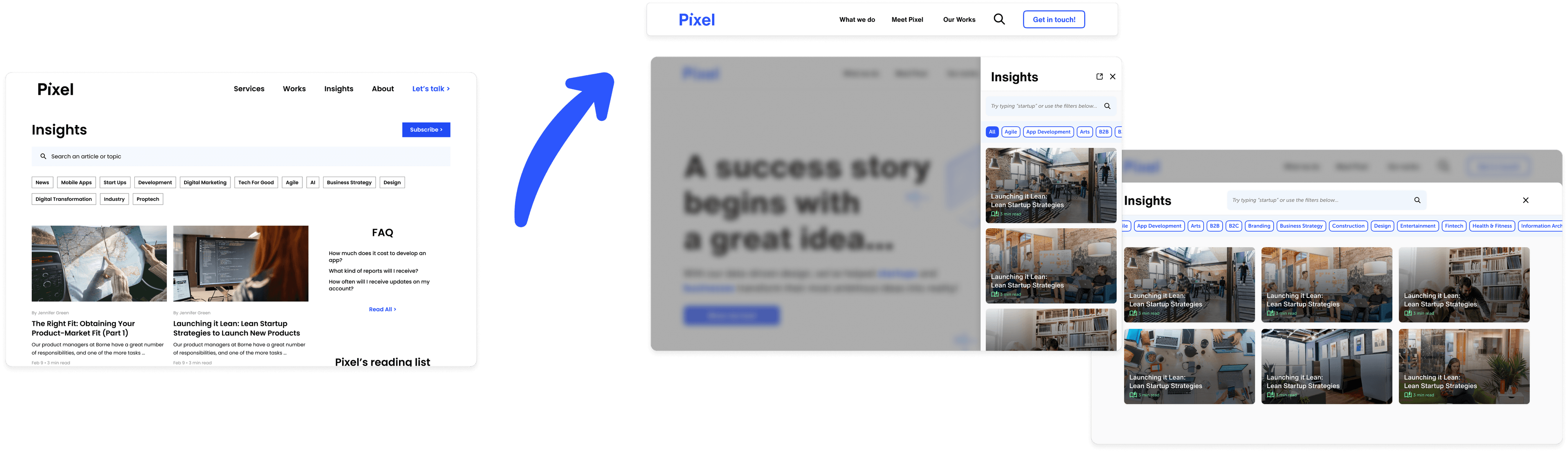
The search functionality is now conveniently accessible from every screen through the navbar. It opens as an overlay, and users can expand it to read entire articles.
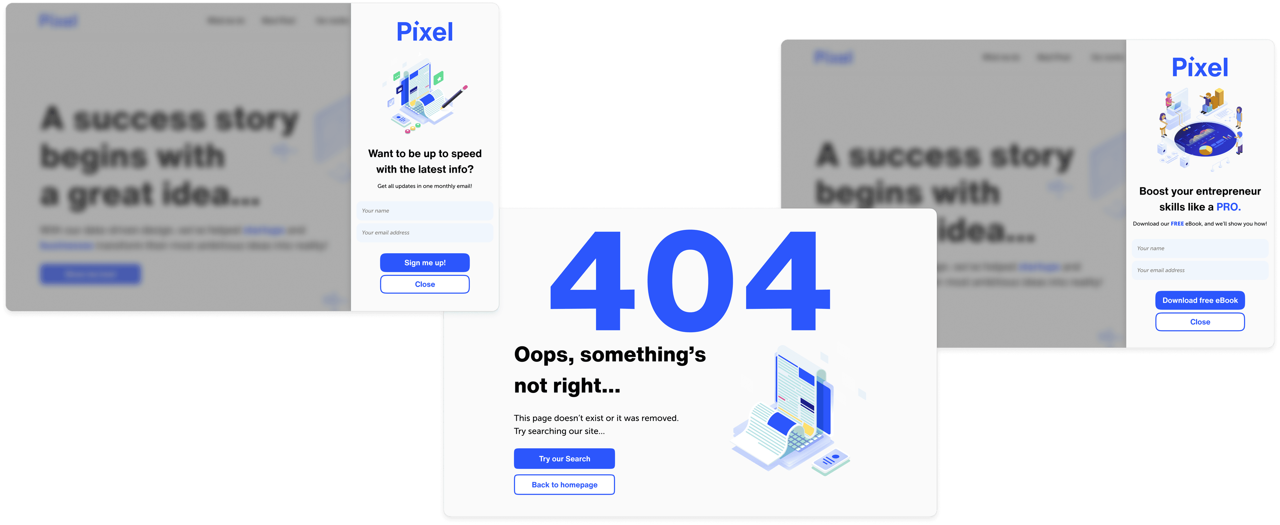
Enhancing User Engagement
To enhance user experience, I've employed a unique design for the newsletter and e-book pop-up. The "x" button has been removed to prevent users from dismissing it habitually. Instead, a "Close" call-to-action at the bottom encourages users to engage with the content, disrupting muscle memory patterns. This decision aims to increase attention to the message. Additionally, empty states with dedicated call-to-action prompts are used to prompt users to utilize the Search function.